6.2 Final Posters and Rationale

Final


poster wall_EDT

Hunt, Madison. Poster Wall. 22nd Aug, 2017

Rationale

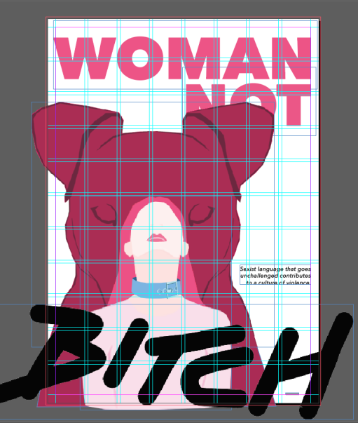
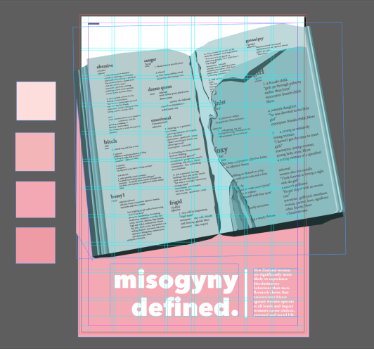
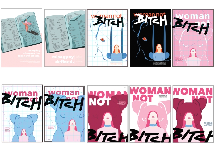
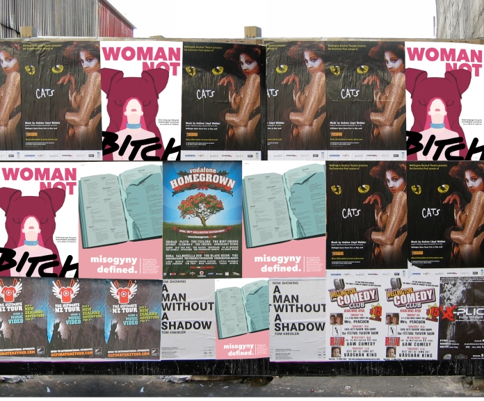
My posters aim is to create awareness of subconscious sexism through the language used against women. I have used the Russian doll metaphor in my first poster. This shows the layers that contain women reflect the labels placed on her. Unconscious language and treatment dominate women, therefore, contributing to a culture of violence. The illustration of the dog makes a comparison between the derogatory term and the identification we make to it. The second poster uses subversion to manipulate the idea of a misogynistic dictionary. This portrays the power of words and that everyday misogyny disregards women’s potential. The image and the headline ‘Misogyny Defined’ reinforce this message, there needs to be a change in the way people talk about and treat women. The wehi in my posters is the sense of familiarity, but also guilt for being unaware of the long-term impacts sexist language has.

Standard

6.1 Final Critique on Posters

Woman Not Bitch

Screen Shot 2017-08-21 at 10.39.08 AM

Hunt, Madison. ‘Woman Not Bitch’ Poster. 21st Aug, 2017.

  • ‘bitch’ has be redone in illustrator to give better quality (no blurry lines)
  • body copy made black and is now three lines to make it easier to read
  • there is blue on the woman’s shoulders/top which will need to be fixed, darker pink as it is too close to the skin colour.
  • decided that it is better to have the headline not going off the page, the viewers eye will go to it and read down, otherwise it would have felt like one whole image cluttered together. It is different but connected to the ‘bitch’ which is going off the page to giving it a more dramatic effect.

Ihi: the techniques, strategies used in the work to persuade or create impact.

  • metaphor -Russian dolls
  • simplified version where the dog/bitch is looking pass the women. It is larger to suggest that the labels she is being called is dominating the opinions of her.
  • The collar emphasises the treatment towards her, less worthy than others/men.

Wehi: the emotional response the viewer has to ihi.

  • You feel sad for the woman
  • think about if you have ever used this word and if it affected anyone
  • guilty for being unaware of the impact/consequences of using derogatory terms, either consciously or unconsciously

Misogyny Defined

Screen Shot 2017-08-21 at 10.38.47 AM

Hunt, Madison. ‘Misogyny Defined’ Poster. 21st Aug, 2017.

  • pink background has been made darker so you are able to read the text
  • dictionary has been made better quality in illustrator
  • make sure there are no small white gaps
  • needs to be a bit more space between the book and the type
  • body text may be too much, no one will want to read that much. This includes the words on the dictionary, for a poster it is a bit text heavy.

Ihi: the techniques, strategies used in the work to persuade or create impact.

  • subversion
  • replacing words in a dictionary and showing specifically derogatory and misogynistic terms (with real definitions).
  • illustration style

Wehi: the emotional response the viewer has to ihi.

  • intrigued at first
  • agreeable to what the posters is showing
  • becoming aware of the power of words
Standard

5.2 Refinement Cont.

Posters

ContactSheet-DVPT2_order

Hunt, Madison. Refinements towards final. 18th Aug, 2017.

Notes

Based on the feedback from the second interim presentation, I have refined my two posters. The ‘dictionary’ poster did not need much work, apart from the type scale/meaning and the image scale/position. I had a few variations that I could them determine what works best. The woman ripping the page may not need to be there, the ripped pages could be enough to portray the emotion and objection towards the use of the words. I think that the words in the first variation were too much and it was hard to fit with the image without it feeling cramped. The meaning of the word “misogyny” is literally “hatred of women”. I thought that ‘misogyny defined’ would be a stronger headline that plays off the image. The body type makes the connection to New Zealand.

Misogyny Reference

The ‘dolls’ poster was difficult for people to understand, I had to make it less complicated while still keeping the Russian doll metaphor. Instead of using multiple animal labels, I decided to just use dog/bitch as I think it is the most frequently used derogatory term. My first poster development didn’t work out too well, the detachment of the dogs head felt odd with the woman (an illustration I used from my other posters). I also kept the headline almost the same, but the ‘beast’ changed to ‘bitch’.  I made the dog a solid instead of outlines and put it behind the women, this reinforced the inside-outside/layers of Russian dolls. This simplified version still contained a strong message, adding the collar shows that women are not animals and should not be objectified or devalued. That the language used is a core problem. I am now working in the smaller details, considering fundamental design principles and ihi/wehi.


Class Review

Continue to work on A2 format. Consider macro/ micro detailing – image, text meaning, type, kerning, rags, widows etc.

Standard

5.1 Interim Presentation #2

Posters

I had gotten some mixed feedback on these posters. It appears that my style and concepts are good but the imagery is a bit complicated for a poster. For the first poster I need to simplify it or change the aim slightly to fit ‘language – animal labels on women’ (being more specific). After all the work I have done on this poster, I would still like to continue with the Russian dolls idea. I could possibly just use a woman and a dog/bitch to make it eye-catching and clear.Not many people understood what is meant by ‘beast’, however my tutor said it was aggressive and had strong juxtaposition to the ‘woman’ text. If I changed it to just the woman and dog ‘dolls’, the text could change to ‘woman not bitch’ which would still hold the same effect.

The second poster was received better, the only feedback I had on that was to make it more dynamic and have larger text. Similar problem with dictionary headline/body copy; it is too small and the ‘Close the chapter’ doesn’t relate to what the woman is doing, which is ripping the pages. There needs to be more careful consideration to how the texts works with the images, I think there is still a bit of work to do before I get to a final outcome.

Standard

4.2 Refinement

Posters

examples of books used in posters

Working on my second poster. At first I was stuck on how to refine this one, having a book/dictionary that showed the language and also portray protest or disapproval of how theses words are used. I found that illustration was the easiest and quickest way I could see my concepts and determine if they could work. I think having a women dwarfed by the book would show how consumed woman are by the language and portrayal of them, it devalues them as there is no male equivalents. This inequality could also be referred to as casual or unconscious sexism. I am starting to look and the text I am going to use. I don’t think this poster will need much, maybe a short headline and a fact/statement.


Standard

4.2 Design Refinement

Posters

Looking at examples of posters with Russian dolls, I thought about how I would illustrate the animals within the shape and where a woman could be in relation to it. Making it look like they are not floating but the doll pieces are stacked and falling away to convey that a woman is more than the label/ derogatory term used against her. That language can confine and over power a woman’s potential and self esteem.


Class Review

We had a short lecture about the process of making our posters. Making iterations/ refinements and exploring a variety of different colours, styles, placement etc. and then printing them out to see what look/works best, this would be done by using thumbnails and cropping L’s. Also the words/text that could be used, nothing too obvious but gets the message across. After we have decided on the best development, then we would get into the micro aspects of refinement.

Standard

4.1 Type and Image

Words are powerful vessels for meaning in visual communication design, words can be used to emphasise, change, contrast, contradict, and /or question the meaning of the message conveyed in our images.

Poster Developments

After presenting my work I found that there was confusion and and mixed messages within my posters. The imagery was not quite conveying the idea of use of language. I was then advised to go back to my initial concept and strategies of the ‘dictionary’ and ‘Russian dolls’ I had set them aside because I was struggling to refine them, but in doing so drifted from my original aim. I should continue with the women not animal concept and explore different styles and illustrations.


Class Review

The lecture was on the relationship of word and image, how they work together to convey the concept by reinforcing, elaborating and emphasising. I found looking at the examples helpful because I got an idea of how I could make visual puns, use single words and manipulating the meaning, provoke the viewer and using type as an image itself. So far I think the concepts and head/tag lines are good, I just need to develop the posters visually. I still think there needs to be more emphasis on the rhetoric in my process. I also need to critique my work on its ihi and wehi.

When making my posters digitally I need to make then in the correct size (A2) so that when I go to print in smaller sizes I will still be able to get the same quality and able to look at it in its final form. properly. This should be done in InDesign and images made in photoshop or illustrator. Start to use grids in InDesign and type should be either made here or created as a vector first then transferred.

Standard

3.2 Aim – Concept – Strategy

Developing Concepts

Concept 1 – “Don’t let labels hold you back”

  • using derogatory terms against women and that language has power.
  • expand and make iterations to the ‘trophy/statue’ poster I had for initial concepts
  • focus on working women, covering their faces – subversion

Concept 2 – “I’m not sexist. I was just joking”

  • show the behaviour that perpetuates negative connotations towards women.
  • unconscious behaviour
  • disregard womens potential
  • use satire or subversion 

Concept 3 – ” I’m not ‘bossy’. I just have better ideas”

  • response to concept 2 – juxtaposition
  • using a term and making it relevant, positive/humorous response
  • develop ‘dictionary’ poster for initial concepts
  • to show that you should not use derogatory/sexist remarks ti undermine women who are good at what they do (because they feel threatened)

Concept 4 – “Loose lips sink ships”

  • war propaganda phrase
  • make is relevant to topic
  • words can do more harm than good
  • keep your mouth shut or else there will be consequences – reference gossiping, men don’t ‘gossip’
  • use parody or subversion


Class Review

Today’s lecture was on aim, concept and strategy. Discussing the process of defining your aim then starting with basic concepts to communicate the ideas, then using specific strategies in making the poster powerful. Continuing to develop and make iterations to our concepts. My aim is to draw attention to the subconscious sexism through language used. I need to decide on key phrases to create irony or humour between image and text – headlines and tag lines. I also need to specify if the language is in a workplace (lower career opportunities) or social life (objectification) context. I need to research visual cues and keep in mind the ihi and wehi. I seem to have a lot of ideas in my head but at the moment am struggling with the process of clarifying and visually communicating my topic.

Standard

3.1 Further Research

Everyday Misogyny – subtly sexist words about females.

“Women are either equal to men, or they aren’t and language that goes unchallenged is one of the many ways we allow inequality to lurk around in the dusty corners of offices. There are huge and shocking implications for gender inequality worldwide. People die, are refused healthcare, or suffer attack as a result of gender. Faced with these atrocities it can feel petty to gently challenge the unequal use of the word ‘abrasive’ but the same system perpetuates both behaviours and it’s all based on the same flawed logic.” – Standard Issue Magazine

Violence Pyramid by Ashley Fairbanks | Sacraparental.com

Ban Bossy

When a little boy asserts himself, he’s called a “leader.” Yet when a little girl does the same, she risks being branded “bossy.” Words like bossy send a message: don’t raise your hand or speak up. Girls are called on less than boys and interrupted more.

This shows what sexist language can do, even at an early age.

VCD Precedents

Looking back at the precedents I have already gathered, I have decided to head towards using photographic imagery in collage to portray my issue. I would like the typography to complement the imagery but also show irony. This could include handwritten text, text overlapping imagery, or juxtaposition.

Screen Shot 2017-08-03 at 6.52.22 PM.png

Standard